UNCLE BOO'S CATFISH CORNER
ORIGINAL LOW-COUNTRY CATFISH
You’ve been Catfished! No, not that kind of catfished – the golden, crispy, tasty kind of catfished. BSR collaborated with the team from Franchise Development Northwest to re-brand and transplant this 40 year old catfish concept and make it into a fresh franchise-ready national brand.
WE’RE GOIN ON A ROAD TRIP!
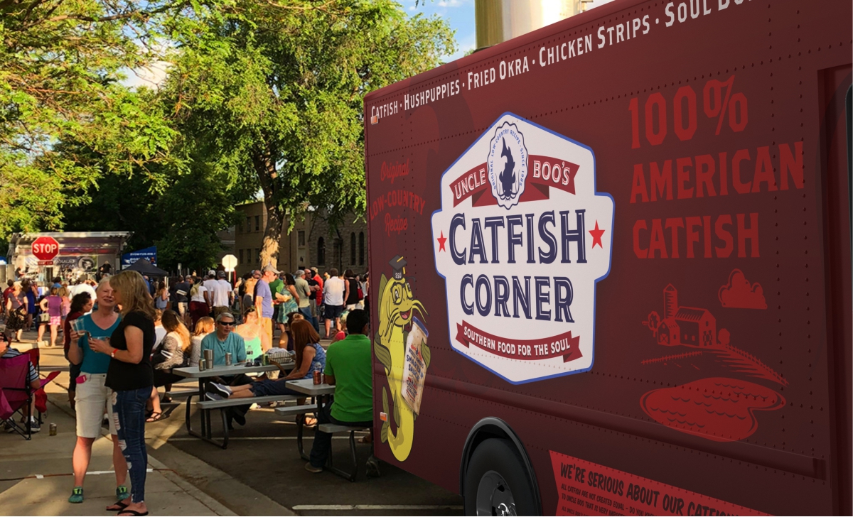
Few things capture the potential for measurable success like the re-branding of a concept. The reasons for re-branding are many and most were evident when we started development of Uncle Boo’s Catfish Corner. Typically operators seek a re-brand when fresh, new, concepts with powerful brand-presence enter their marketplace resulting in lost customers and sales. But the reasons for this re-brand were different – the concept was re-launching in Atlanta, GA with the first iterations being a stand alone brick and mortar store, a cutting edge food truck and three modern walk up locations in the new Merceded Benz Stadium.
THIS BRAND’S GOTTA MEASURE UP
Mercedes Benz Stadium has some steep criteria for inviting food concepts into their facility. Fortunately the BSR team has decades of experience working with professional sports teams having built both food and retail concepts in national stadiums like the Yankees, Dodgers, Chiefs, Seahawks, Mariners, Chargers, Titans and countless others – so this project was well in hand.
UPDATING AND UPGRADING UNCLE BOO
Our development of the new re-boot started with the identity and the brand story. BSRcreated custom typography for the logo type and developed “uncle boo” into an actual character – a catfish character. We also set about the tell the brand story and a large pictographic wallscape was created to carry the messages of freshness, authenticity, sustainability and above all, American. No imported products what so ever would be used in the product. It was also in this stage that the tagline was developed to capture the essence and the history of this American culinary favorite, “Original Low Country Recipe”.
DESIGNING THE LOOK AND FEEL
Next came the development of the restaurant design. Given the food style (fried fish) all of the materials in the restaurant needed to be bullet proof but that doesn’t mean they would lack style. On the contrary all of the materials are very high end feeling with glossy beveled subway tiles in the exhibition kitchen, custom oem finished stainless on the counter surfaces, acid washed concrete floors and native low country Cyprus wood throughout use in everything from furniture to millwork. A stylish tile mosaic was developed for the back kitchen partition with a colorful inlaid brand message and the pictographic wallscape created in the branding phase was added to key elevations. Soaring overhead is a painted wood trusswork reminiscent of a southern tiered arch bridge and custom lighting elements, including Mason jar groupings (complete with fireflies inside)! Overall the look is contemporary without looking slick and traditional-industrial without looking themed. The client calls it ‘stunning”. We agree!
