


LONG ROAD TO LONG BEACH
Aren’t all roads leading to the opening of a craft brewery long roads? It seems so. More than two years ago BSR was asked by the husband and wife co-founders of the Trademark Brewing Co. to create a powerful new brand and design their new craft brewery project. Fast forward 28 months, hundreds of conversations with city planners and thousands of gray hairs later and the opening of the Trademark Brewing Co. is just a few short weeks away!
BEING THIS – WITHOUT BEING THAT
The development for the TMBC brand was challenging. There were myriad directions the client liked but didn’t want to go in but there were no firm directions the client did want to go in. One thing was certain. We needed to craft a brand language with the client before we could begin crafting a brand language for the customer.
DESIGNING THE IDENTITY
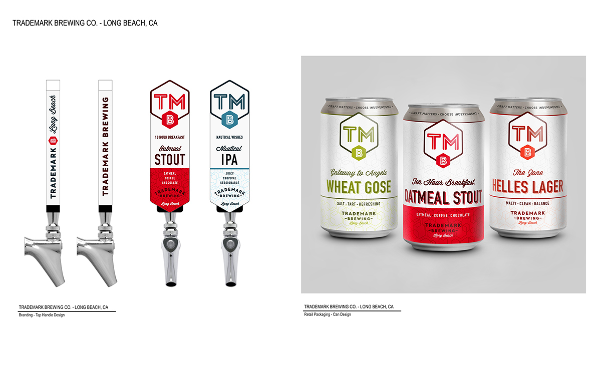
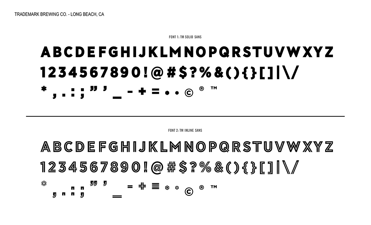
BSR collaborated with the client team to invent the TM brand. In most cases new brands struggle to become visible and recognizable. That would not be the casewith Trademark Brewing Co. With such a recognizable name to work with we placed the TMB initials atop the masthead on day one and the development of three sturdy sets of proprietary typefaces followed close behind. Along with the logo and proprietary typefaces we designed a set of hexagonal shaped graphics, characterizing the chemistry involved in the brewers art.
A NEW BREWERY FOR LONGBEACH
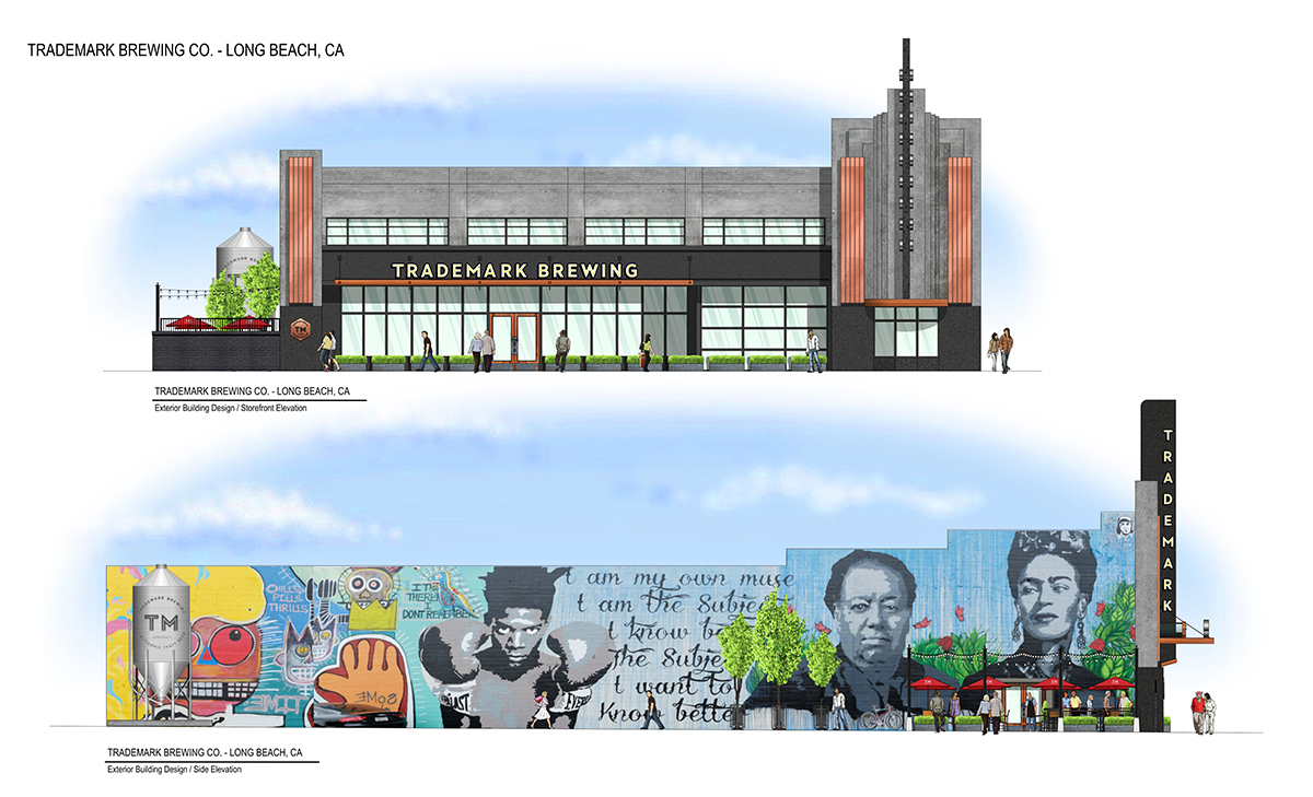
The impressive 20,000s.f. manufacturing space is a perfect space for a brewery. It has fifty foot high arched ceilings with soaring trusswork. There is office space on the existing mezzanine level and a perfectly situated space for a tasting room at street level. One detractor was the condition of the existing storefront. In the late 1940’s there was poorly rendered art deco theme added to the exterior of the building and our budget did not allow for a complete rehab of the exterior. So what do you do? Make it a feature, that’s what!
THE BREWERY DESIGN
The exterior facade needed a total makeover. The paint and other finishes were peeling badly in some places and falling off in large chunks in others. To bring this back to life we installed a completely new elastomeric concrete surface on the store front, making the building look almost new. To this we added redwood truss work, raw copper and hot rolled steel awning and window frames. The large pylon was completely rebuilt and upon it is installed a massive marquis sign in stunning neon. And the one art deco features that we thought would pose the biggest issue in updating the look of the exterior; two massive fluted columns; we finished in burnished copper leaf. Beautiful.
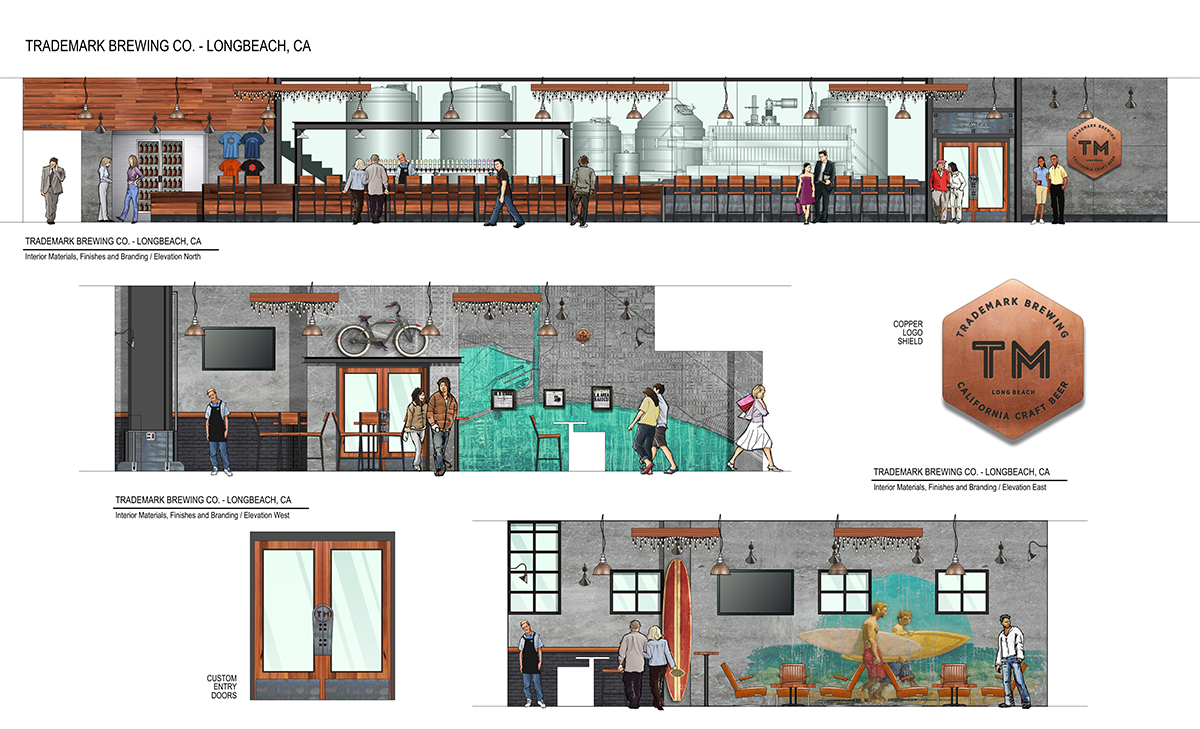
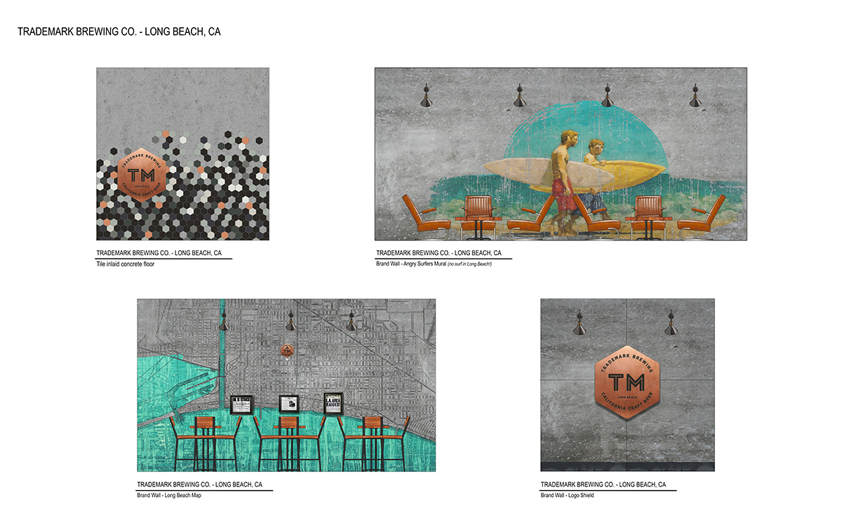
The tasting room is designed with a blend of industrial and contemporary aesthetic. The bar is faced with recycled oak boards rescued from a turn of the century warehouse in LA and the counter tops are hot rolled steel plate. A glass partition separates the brew plant from the tasting room and a combination of warehouse style dome ceiling fixtures and industrial wall sconces creates just the right mood. And to top it off festoon string lighting mounted to used shipping pallets mounted to the ceiling creates a fun “outdoor dining feel”. Well done!